Showing posts with label donini has intelligence issues. Show all posts

Tuesday, October 27, 2009

Panini Gives Us All A Good Laugh With Limited

So far, the cards out of Limited are showing strong on both ends of the spectrum. They range from amazing and really cool to complete and utter fucking shit that we are used to from amateur cards inc. Hailing from the definite cool end of the spectrum, the rookie phenom patch autos look AMAZING. The problem is, some of the checklist seems to be redemptions. Normally, that wouldnt be a problem if the cards were hard signed, but these are all fucking stickers from players who were present at the rookie premiere.


For those of you who are unfamiliar with the NFL rookie premiere, let me enlighten you. For an entire day, you have the players at your disposal to take your photos, do your intereviews, and MOST importantly, sign their goddamn shit. As we are slowly starting to realize, Panini had one of the biggest and most EPIC fails with their planning, as obviously they did not get the stuff signed that they needed to. Hell, maybe the players didnt have enough fucking time to sign Panini's complete slate of sticker auto cards. There may just have been that many. This is of course, after they had over 50 helmets to sign for different friends of the company, hundreds of cards for the attendees, and football after football for other people in attendance. Again, not out of the ordinary in terms of what usually happens for every company, but when you force yourself into redemptions because of it, you become a quintessential bush league player. Then again, when you see stuff like these bubbly autos in other products, it becomes clearer why things look like they are being run by monkeys.

You see, this isnt the first time Panini, or DLP at that point, has failed to get their shit signed. Back in 2007, 99% of the Adrian Peterson auto stickers in limited were redemptions as well. He was even the guy on the fucking packaging for half the products. This was also the case with Troy Smith, and Chris Johnson, as well as others. Of course, if these were hard signed cards, it would be completely different, let me reiterate that point. However, Panini is more focused on inserting 2008 hard signed cards into their 2009 packs than really doing it the right way.

So far, here is the list of redemptions for their 2009 stickers:

Hakeem Nicks
Tyson Jackson
(Among others, surely)

This begs the question, if they couldnt sign all their stickers at the premiere, just how many labels is Panini actually using? It has to be above the number humanly possible to be signed, which then makes me laugh even more, especially with all the "We are moving towards hard signed stuff" marketing that they are shitting out their ass.

Considering this is a set that again features smoke and mirrors with the event used pro-bowl jerseys, and ball and pylon stuff from the super bowl that may not even be game used, a black eye has started to develop for 2009 Limited. Its really too bad, because this set definitely had potential, even though their cuts dont have pictures on them.

So, Panini, WHAT THE FUCK IS YOUR DEAL?!?

Tuesday, October 6, 2009

A Comment On Donruss Certified

After seeing that Brett Favre is going to have his first Viking "auto" in Certified on Panini's webpage, I want to say a few things about the set preview they posted. Certified is next on the calendar, I believe, and is another in the mid end set line up that Donruss releases every year. Threads, Certified, Limited, Gridiron Gear, they all usually blend together.


First, I am actually surprised that Favre's auto card looks pretty good. Aside from the horrid foil board that its printed on, and the fact that it looks EXACTLY like last year's set, its not bad. The problem is that its just too easy to slap a sticker on the card and call it his first Viking auto. When you are almost 100% stickers in your sets, its kind of a cop out to claim that you are first. You could have put him in a Twins uniform and called it his first Minnesota auto. That sticker sort of invalidates the claim. Besides, it wont be about quality as the card will probably go for hundreds, despite the Playoff hologram background on the Donruss sticker, and that it will most likely only have 5 copies.

Second, the preview shows some pretty cool looking cards from the set, which made me feel weirdly anxious. Of course, these are all some of the best hits of the product, so I will withold total judgement until I see the rest.


The dual swatch freshmen fabric cards look great this year, surprisingly. They went back to the horizontal stack rather than the vertical stack, and it works SOOOOO much better. I may actually want a few of these, even though the rainbow foil is completely distracting.


The fabric of the game autos look good as well, but again, these are rare ass fucking cards, maybe limited to 5 or 25 copies at the most. The swatches are even in the right place, yet, I am very scared as to what the normal, non-auto versions look like.


The triple and quad swatch freshmen fabric cards are just as bad as they were last year, floating swatches and all. The quads are almost too busy to comprehend, and they break the design borders, unlike the duals which look cool. The souvenir stamps also look as bad as they usually do, mainly because that stray swatch looks extremely out of place. Although the rookies finally found a way to fit their signatures into the window below the stamps in these cases, others wont be so lucky.


Lastly, these Immortals cards are ridiculously awful. Yes they feature swatches and autos in some rare cases, but the player is being chased by huge obscuring text and out of place windows and stickers. Just a poor design and a poor decision to try to stuff all those things onto the cards.

Overall, I am still VERY apprehensive about this set. If these cards are the best of the best, and they just spike my awesometer to a normal expected level, what will the rest be like?

Tuesday, September 29, 2009

Its Funny Because Its True...


The fact of the matter is that Kobe is only one brick in the wall that needs to be built for Panini to actually have the success they need to counteract the license money they spent already. Per many industry people, they grossly overpaid for the ability to produce NBA cards, then spent absurd money to sign Blake Griffin and company, followed by throwing more money at Kobe, when they still have no Jordan, LeBron or others.

Design is also going to be a huge factor, there is no question in my mind. With UD being the overwhelming fan favorite, to go from the best looking sets of the card year, to the ones that look like the unholy abominations they create in a lab somewhere for football, is not going to go over very well. Basically, Panini is not going to compete, especially with UD most likely continuing their basketball production. Even if they get Jordan or LeBron some how some way, I would still see collectors going away than continuing to buy the Panini junk. Think of it this way, if Mercedes left the market and all that was left is Kia, people would still go buy old Mercedes for their luxury cars rather than switching to a inferior brand.

Dont get me wrong, there will be some who will embrace the change, but not the collectors that UD hinged their continued success on. Basketball is a different animal, with the majority of the collectors focusing on super high end rather than the base stuff and mid end like the other sports. This is only further evidenced by the fact that even at 800+ dollars a box, 09-10 Exquisite sold out in 3 hours, even though 08-09 Exquisite was less than two months old. Without Jordan, LeBron, Garnett, and the other UD exclusives, Panini has lost the ability to duplicate that cash flow to subsidize the brand. They can pump out shit like Prestige and Limited all they want, but its not going to make up for their inability to cater to the existing install base.

Personally, I feel bad that Basketball collectors will now have to settle for this:


Instead of this:


Thanks to Mario for the UD poster.

Friday, August 7, 2009

Some Cards Just Make You Feel Bad For the Designer

I dont even know where to start criticizing this card's swatch placement or die-cut design. Its almost like they put the card up on a dartboard, and threw two darts to determine where to put the windows. Well, at least they hit the center?

Wednesday, August 5, 2009

Review Not Necessary: 2009 Leaf Rookies And Stars

I didn’t actually realize that Leaf Rookies and Stars comes out as well as UD Philadelphia, but to tell you the truth, I am glad that was the case. This is due to the fact that even though Rookies and Stars looks nothing like last year's product, which is a feat for Panini, it could be the worst design choice of the year. In fact, im not even going to waste the hour writing the product review, only to give it less of a score than Score Inscriptions got.

R&S takes the same idea as Inscriptions of going "urban" with the design, incorporating graffiti like bordering, as well as a weird obsession with paint spills. The text and font choice is just as bad, as the way it is featured could not look more stupid. Imagine the way a neon sign looks when it is turned off, and you have the font for some of the subsets of R&S. Otherwise its just weird looking stencils.

This product is also FILLED with floating plain swatch cards with hundreds of parallels, just the way Panini loves to do it. Honestly, why are these cards even necessary? Oh, right, because they are too lazy to fill out a whole set.

Lastly, we have the worst of the worst. As if you thought the Panini style Manu-patch autos werent enough in Prestige, THEY'RE BAAAACKK! Only this time, the players are stuffed onto a smaller border and covered in a paint spill. Cmon, enough with this poop of a product.

Ill be honest, of all the products that have been released since 2007, Leaf Rookies and Stars is the one product that I have never bought a single, pack, or box of, mainly because the cards have always been so stupid looking. The main rookie part of this set has helmet off pics, so it makes it even less attractive to me, and the design has NEVER been good.

Add this set to the list of products that needs to get the axe.


Monday, July 20, 2009

First Look: 2009 Leaf Limited Football


First off, let me say how surprised I am by how good some of these cards look. Have things started to turn around for the bastard child of bad ideas and poor design? Possibly.

The best part about these cards is that they seem to be the first design update for any release that Donini has had for the entire year. They acutally look somewhat different from 2008. As for the Leaf Limited slideshow autos, the design looks pretty cool for me, the best of the previews. When it comes to all the RC Phenoms Patch Autos, the one they showed looks much better than last year, though I am VERY scared for the parallels that are not out of 5. Usually with these cards, there are a million parallels, and many of them just say "RC" in die cut windows, or have the number of the player. These particular ones will be the most short printed of the non-logos, and I cant fathom where they are going to put the patch for the normal card out of 99. The Cut autos look very good as well, but I never really saw the appeal in cuts to begin with. At least if you pull one, it wont be a crappy looking card.

The Letters are always a favorite of the fans, as they are really the only game used autographed letter cards out there. Factoring in that these will also be pro bowl ones, will make people very happy. Personally, I know they wont be the ACTUAL Pro Bowl jerseys, but rather a practice one or something similar, as the actual ones are coveted possessions of the players. Plus, im not a fan of the pro-bowl to begin with, so its not a big deal to me. Hopefully there will game used ones as well.

Lastly, there are a few AWFUL parts to this product. Of course, the main one is that the base cards look ridiculous, especially when they have a swatch involved. Although the swatch is in the right place, I cant get passed the hypnotizing design. What an awful choice for a theme for the set. Secondly, for what you get, the price point is going to be beyond stupid. They are going back to the one pack box, which I wholly support, but they are giving you 1 auto and 1 jersey for 100 fucking dollars. Sorry, but Limited is always a good affordable option for higher class cards, and they are now taking that away. Very problematic to me, as they just priced me out of a few boxes, especially with dealer markup. Then, when you add in the diluted RC premiere class from 2009, and you just priced a lot of the rest of the collectors out of this product. This will be a big problem, and I dont think Donini knows any better.

You can color me exicited for the possibility of buying some cool singles, but I will not even consider buying a box of Limited this year thanks to the configuration. Too bad really.

Wednesday, July 8, 2009

PLEASE Stop Using The Payton Phone Cards As The Source For Cut Autos

Im sure you have all seen some of the wonderful Walter Payton autos that have been produced over the last 10-20 years. Luckily for us, he lived up until the auto boom in the late 1990s, so he has some great auto cards for collectors. In fact, his 1997 Legends auto may be one of the greatest autograph cards ever produced for football.

Payton also signed a ton of stuff throughout his life that could be considered source material for cut auto cards. Yet, for some reason, Donini has decided that this is all irrelevant crap to them. Since 2007, Donini has produced hundreds of Payton cuts, none of which feature worthy source material. Instead they purchased close to 500 of the Payton autographed phone cards, and used those as the cuts. These phone cards are great for people that cannot afford a normal Payton auto card, but to use them for a football card is almost as ridiculous as cutting up a Topps card to use in an upper deck cut.

There are a few reasons why I am repeating this after my post regarding last year's Classic Cuts set. First, its almost impossible to see Payton's auto on the colorful pictures. They are old, they are fading, and the pic he signed is dark. Add in that these cards DO NOT FEATURE NAMES OR PICTURES and you have a serious design problem.

Donini, I know you guys are turning out to be barrel full of stupid idiots, but you gotta stop with the phone cards. Just because they are cheaper to make, does not mean it is worth it. We see through your veiled attempt at producing a card worthy of calling a cut, and I guarantee that this will bite you square in the nuts. Count on it, because cutting corners is never worth the time of anyone.

Wednesday, July 1, 2009

Product Review: 2009 Donruss Classics Football

Today is a big day, believe it or not, as we finally have a set today that pictures the rookies in their NFL uniforms. Classics has received a lot of coverage here because of that fact, and Donini knows that they are under the microscope now that things have changed for the company. Although the set has some bright spots, it seems like things may not have been as thought out as they should have been. I will say that this is the best offering so far from Donini this year, but considering that their previous releases have been loose poops, its not saying much.

Design/Creativity

First, I want to preface this by saying that I have always been a big fan of classics. I still think the base RC of Adrian Peterson from 2007 is one of the best non-auto Peterson cards there is. 2008's base design wasn’t bad either, as the cards had the look I was hoping for. 2009, well, that’s a completely different story. Unlike the previous two releases, Donini decided that this year's product would not feature a nicely designed base set, but instead would use boring square borders and the back of a 1940's wicker chair as the background for the pictures. After seeing the result of this, you have to say that it just doesn’t work for this type of design. The problem is that the square border adds nothing to the character of the card, and the background does not do it any favors either. Instead you have players who look like they are cardboard cutouts photographed against the chair and then put on the cards. On top of all of this, it clashes completely with some of the uniforms, which takes all the fun out of it. At least when they left the field in there, you knew what to expect.

Secondly, Donini has improved the design of some of the subsets, but they are still employing the fucking awful three step parallel process for them. Step 1 - numbered base card, Step 2 - memorabilia card, Step 3 - Auto or auto/jers card. This time it seems to work on SOME of the subsets, but you can still see the places where things will fit, leading to the thoughts of why the parallels exist in the first place. Regardless, the Sunday Stars look good with the swatch finally having a good home, the Saturday Stars look a little worse but still good, and the School Colors havent changed one bit from last year. On the other side of things, the Monday night heroes have MAJOR floating swatch issues and the Classic singles look oddly weighted. Other than that, its standard fare for Donini.

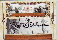
Lastly, the Cuts have problems, lots of problems. To begin with, there is no picture of the subjects on the cards to make them look presentable. They are just a border on a cut, and that doesn’t work at all for me. Secondly, there is no name on the front of the card either, which means it could be fucking impossible to determine who you pulled if you arent familiar with a lot of signatures. This is completely amateur, as there is no reason to leave out a picture, let alone a name, especially when a good portion of the people who pull these cards will be casual collectors. Bad form.

Rating =

Autograph Cards

Man, these autograph cards are a train wreck for some parts of this product. I don’t think there is any other way to describe the ideas behind some of the cards.

The most important cards of the set are the Auto RCs, and because of the swap meet rug background, its beyond tough to see some of the stickers. That is just poor planning, nothing else. If you know that you are going to put black writing on a card, you have to plan around a light background to create that pop we all love in a dark sig. This has none of that. Plus, when some of the rookies are signing early stickers with college numbers, all while the company KNOWS they will be used throughout the year, you can expect the complaints that will come. As Jake said on Twitter, don’t sign the numbers and you don’t have a problem.

Moving on to the biggest fail in this product, the School Colors autos, and you can see the extent of how poorly these cards were planned. Its like Donini thought that by putting out on card autos, they could blind us enough to look the other direction in design and pen choice. Companies avoid using paint pens on cards because they can stick to the back of other cards during pack outs, they can chip as time goes on, and because they look gross. If I were waiting outside of the OTAs to get an auto in person, I might use a paint pen out of necessity. For card companies, use need to use a fucking sharpie/staedtler like normal people. However, if you MUST use silver, fine point pens are available instead of the thick pointed paint ones used on these cards. See UD Black Baseball 2007 for examples.

The one bright point of this set is the Sunday and Saturday Stars jersey auto cards, which look very cool. It’s the only redeeming point for this offering at all in terms of autos. The cards look well thought out, well put together, and professional. The problem is that they are two subsets, and numbered to 25 a piece. Kind of a drop in the bucket. I would give the autos two Gellmans if these were a focus, but they arent. The rest of this has way too many problems.

Rating =

Relic Cards

As said before, the relic subsets in this product are very much improved over Prestige and Prestige Chrome. Donini is heading in the right direction on some of these cards, as the cards look like they may have taken into account the fact that swatches and stickers will need to be incorporated into the design. The Sunday Stars and Staturday Stars look great in this respect, but others do not follow the same suit. The Classic singles look oddly unbalanced, and should have just had two swatches per player, and the Monday Night Heroes subset was definitely backwardly designed old school junk from the Donini floating swatch factory.

When you move up into the patches and the duals, things continue to go well, but there are still many problems that Donini needs to address before I can count them among the saved.

Heading in the right direction is good.

Rating =

Value To The Collector

This set always holds water because it’s the first for pro jerseys. However, there are no rookie relics from the premiere, and there is a staleness that is creeping in on classics. I think the overall price will drop per normal as the year goes on, but these cards wont drop the way prestige and prestige chrome will. You may have already noticed how little value the previous sets held compared to last year, and its only going to get worse.

Although I wouldn’t suggest buying boxes of this product with reckless abandon, I would suggest checking out some of the good looking singles that will be out there.

I will mention this, I am not the only one who is touting the poor quality and creativity of Donini products, and price has started to show some of that apathy. Cards that would have gone for 100 bucks last year are going for $50-$60 this year, which is too much of a drop to attribute completely to the recession.

Basically, I would be very careful before blowing your load this early.

Rating =

Overall Impressions

Although Donini is heading in the right direction, improving from total fucking shit to acceptable is starting to seem like an inconceivable jump. With as bad as the first two products were, compared to classics, I am getting overwhelmed with how much needs to be improved. There are so many things present in this set that no professional would ever do in their right mind, and that scares me for the future of this crap. Plus, when you start to see them influence their man-crushes at Beckett to the point where they are singing the praises to the mountaintops, you can tell they just arent trying anymore. Instead of designing products that should be sung from the highest peaks, they use underhanded marketing tactics to force people to avoid looking at the obvious.

Average Rating =

2009 Product Leaderboard (SO FAR)

1(t). UD Heroes Football (3/5 GELLMANS)
1(t). UD Draft Edition (3/5 GELLMANS)
3(t). Donruss Classics (2/5 GELLMANS)
3(t). Donruss Elite (2/5 GELLMANS)
3(t). Playoff Prestige (2/5 GELLMANS)
3(t). Bowman Draft Picks (2/5 GELLMANS)

Tuesday, June 30, 2009

Two Updates On Classics

First off, I cant stand that Donini decided to use college number signature stickers for a few of the players. So far, Percy Harvin (pictured below) and Chris Wells have their college number signed on those stickers, but im sure there are more players with the similar bush league treatment of their first pro uni autographs. If Crabtree can have stickers with his pro number signed, albeit poorly, there was no reason that this error couldn't have been fixed before release. I thought the purpose of getting stickers was to avoid shit like this. Fucking losers over there in Donini QC.


Secondly, why is there no name on the front of the cut autos? Dont you think that is a vital piece of the puzzle? Seriously, you have already edited out the picture of the person who's cut the card belongs to, but why not include a fucking name?!? Stupid motherfuckers.

I already have major problems with the fugly school colors sig cards, due to the silver paint pens, but adding this to the list is idiotic. Stupid errors that should have never been included. Yeah, no redemptions maybe, but a product full of crap like this wont fly with me.

If we get to Absolute and the same shit is happening, Im not even going to waste my time anymore. Donini has continually asserted themselves as fucking amateurs, these are great examples.

Friday, June 26, 2009

A Result Of Collective Stupidity

One of the more awesome trends in the industry is that regular cards can have amazing patches. What this means is that you dont need to face astronomical retail type odds to get a team logo or something amazing in terms of a patch. This also means that products like Triple Threads, and other products that rely on contrived scarcity to bolster value, no longer can justify the fact that 1/1s are special in any way from the rest of the product. Right now, more than a giant handful of Topps 1/1 cards are either printing plates or paralleled cards that share nothing more than a different finish on the stock.

Of course, this has led to a major devaluing of the 1/1s, because they arent worth the chase anymore. I can get a Topps Sterling 1/1 and have it look WORSE than the card out of ten. Shouldn't we just let the cards showcase what makes them special instead of forcing me to stomach a whole product's worth of cards numbered to 3, even though its really something like 103?

A while ago I said that they should get rid of inserting the print plates into packs, as they are worthless, fugly pieces of scrap metal that are marketed as a chase for people who dont know any better. Im saying now that we should abolish the non-special 1/1s for all non-chrome products. If they want to put a logo on a card and number it 1/1, be my guest, but if they are just going to say the card is arbitrarily a 1/1 because of a different color on the card, a different die cut swatch, or even if there is NOTHING different, I wont support it.

Parallels are ridiculous in this hobby and I think that Topps high end and Donini mid and low end are the worst possible offenders. Donini parallels each SUBSET card at least fifteen times, you have the regular, numbered parallel, jersey parallel, second lower numbered parallel, auto parallel, etc, etc. That sucks, there is no reason to do this at all, other than accounting for laziness in filling the needs of a product.

Im now a supporter of letting the card's features speak for themselves. If you get a great looking card with a ridiculous patch, it should be worth more because of that, not because its numbered to 7 or whatever. If you get an auto'ed version of a card rather than a regular one, that should be the reason that its worth more, not because its red rather than green.

Its become apparent that this hobby has thrived on greed and ego for many, many years. Someone needs to feel good that they have the ONLY ONE of that one card, someone has to know EXACTLY how many of a said card there are, they need to be the biggest shit out there. No longer are we focused on buying the cards we like or the cards that make us happy, we have to have the most of the rare, the most of the special, and we need parallels to tell us that we do. That is crap.

This fact has allowed the manufacturers to exploit our need to feel special by numbering things lower and lower, yet in reality just letting design quality slip so that the number on the card is the only thing we care about. Look at Upper Deck SP Authentic Baseball, there is so much confusion over the numbering on the letters, that people have literally freaked out. Upper Deck makes it worse by numbering each letter rather than the total number of autos to make the cards seem rarer, and we eat it up. Is your signed G numbered to 5 different than my signed G numbered to 25? NO! Its the same fucking card with lower numbering.

Ill give you this, the collective stupidity of the normal people in this hobby will prevent any semblance of a different hobby from ever surfacing. Collectors are generally so fucking stupid, that companies are even forced use numbering as a way to deter fakes. How absurd is that? People cannot survive in this industry without it BLATANTLY spelled out for them, no one is capable of thinking for themselves. This is why jersey cards have become so overdone, and why parallels are everywhere, because the idiots shit themselves with anticipation over whatever is the latest marketing ploy. It would be one thing if they were clever, but really these ploys are always mind numbingly stale.

It may be a problem in every industry, mainly because Americans are intrinsically stupid, but I get the aura of simpletons more from sports cards than from any other consumer group I follow.

Thursday, June 25, 2009

The Donini/Beckett Love Affair Continues: How Far Does It Go?

So, Donini sent over another box to Beckett, again a week early. Im sure it was for all the "favors" to be named later, but this one gave us some indication of how deep the love affair really runs. Not only was it a week early, fresh from the factory, but it contained an auto that Donini has been publicizing non-stop since the Premiere last month.

They managed to "pull" (being a subjective term) a Percy Harvin School Colors fugly silver paint pen auto, which in itself isnt that big of a deal. The reason I am mentioning this is solely because of the sheer fuckload of marketing they have done on these cards. They have released digital galleries - twice - as well as provided extremely visible coverage from the premiere signing of the cards.

After seeing all of this marketing crap, I guessed that it was happening because when Donini releases an on card auto subset, its a holiday! No matter that they are fugly beyond belief, they are just happy to be a waiter at the on card auto dinner table, right?


Obviously, post-beckett break, its making a little more sense to me. Considering that Beckett was delivered a box with a top of the class auto from this set, we are now seeing the purpose of the Beckett box break. Its no longer about setting unrealistic expectations for the box breaks that are done by real collectors, but now its about pimping your ugly ass subsets to draw up needless buzz. My uncle, an emmy award winning writer, once said that hollywood only advertises early when its a dog, otherwise they let the stuff speak for itself - then blow it up. Here we clearly have the dog, being blown up as long ago as the fucking rookie premiere. Then you send a fresh box to Beckett with a "great" example of that target? Cmon, im not that dumb.

Im not even going to talk about the 2 patch cards they received in the same box, something that NEVER happens in boxes of Classics.

Lastly, on an unrelated note, Im happy that Donini has sort of solved their floating swatch problems, as some of the jersey cards look good. However, they majorly fucked up the base formula by editing out the field and replacing it with a weird ass brown background. Im not sure why, as I think the field is ABSOLUTELY necessary to do a picture it's due justice. Without it, you just have overdone photoshop abortions with no character.

Wednesday, June 24, 2009

Spoilers on Donini's "Big" Announcement

Yesterday, Donini said they had a big announcement to make via facebook, and I have gotten some information that it is to announce some NBA exclusive contracts from tomorrow's draft. Blake Griffin will be one of these people, which begs the question of why the fuck are they making such a big deal out of this WHEN THEY OWN THE EXCLUSIVE LICENSE? More importantly, without LeBron James, Michael Jordan, and Kobe Bryant, should they be wasting money on exclusive contracts when they should be figuring out how to overcome the obsticles that Topps faced when producing their basketball cards.

I am guessing that UD made no attempt to gain exclusivity with the top draft picks from this year's class, and that Donini was probably negotiating against themselves. This will mean that there will be a few things they have grossly overpaid for, instead of just one. Im guessing that they already lost many fans when UD leaves, as they are the only ones who produce cards of three of the only people who are worth anything in Basketball. Seriously, all UD has to do is put out a product with Bryant, Jordan and LeBron, and it will automatically sell more than any Donini product rookies or no rookies, team logos or no team logos.

I think its fucking hilarious that Donini thinks this announcement is worth a press conference from NYC the day before the draft, especially now that their products have about as much clout as Topps Opening Day. In fact, maybe Topps and Donini should have a sit down to discuss the level in which the basketball products will fail. Shall we talk about Eschelon, Lettermen, and Triple Threads? They definitely did not live up anywhere close to their price.