.jpg)
There is one question I have been asking lately, and that is in regards where the Panini design team has been hiding. They obviously havent been designing good looking cards, so I was curious if they even actually existed. Well, I think I found the answer. They have been holed up trying to complete the design for Crown Royale football, a new product in the Panini line. Not that the cards are even that good, just that they are so utterly complicated that it must have taken them 10 minutes to design the cards instead of the usual 2.
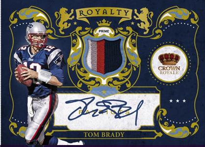
All kidding aside, Im not sure how I feel about these cards. A few of them look like playing cards, and others look straight out of the 17th century due to their ornate designs. The problem seems to be that some of these cards are so busy and complicated in their border work that I don’t know where to look. The other problem is that these cards from the preview are the ridiculously low numbered parallels that feature both the autos and the jerseys, so what happnes when you subtract elements but don’t change the design, as Panini normally does? I think the single jersey cards of the Peterson and the Montana, as well as the Bryant and the Brady are going to look ridiculously unbalanced and top heavy.
As for the base design, I think its terrible. When you add in the auto, like on the Bradford, its worse. Im not sure why they are trying to stuff a sticker onto the card when it obviously has no place to go. That is poor planning and the base design should have been adjusted if that was the plan all along.
Im also torn on how I feel about the Royalty cards. I think they would definitely fit in a set like National Treasures, and the concept is interesting in the way the cards are designed. Again this subset plays into the overall theme of the product, and Im still not sold on that as a whole. I get that Pacific made these cards famous, but I don’t really see the appeal of creating a set based on a defunct brand that produced some really ugly cards.
This may in fact be one of the products that we need to see the finished product before we can pass final judgement, but right now, im still deciding if cards like the Peterson and the Gerhart have enough spunk to carry a product that doesn’t seem to pack a lot of punch. It is pre-selling at under $100 on ATLSportscards, and from the layout, it looks like it is going to be similar to Absolute with 1 hit per pack, 2 autos per box. Street date is set for the same week as Topps Chrome, so I guess its not a surprise that there hasn’t been much pub on it.


Friday, August 20, 2010
2010 Panini Crown Royale Confuses Me
Subscribe to:
Post Comments (Atom)


I don;t even collect football, but these cards are so appealing that they garner my interest. I loved the old Crown Royale brands.
ReplyDeleteI think I just had a seizure from those card designs. Wayyyy too busy.
ReplyDeleteWith the exception of the typical Panini black & white backgrounds (and of course those crazy patch cards), these are almost exactly like the old Pacific Crown Royale hockey releases.
ReplyDeleteThey are so awful looking. So far I only like the Donruss Elite from Panini (in 2010)
ReplyDeleteI got a question. The Toby Gerhart, is that supposed to be jersey that is surrounding the cutout? It looks like it, which make no fucking sense
ReplyDeleteI kinda like that, they are so busy it works.
ReplyDeleteI think the die cut picture over top of the jersey piece is kinda cool. It is something I haven't seen before, and that is worth something.
ewesnsel, you say that makes no sense, how so? How does that make any less sense then a square piece of jersey on any other card?
The only thing I see as a downside is that most of the cards look to have sticker autos.
This is probably the first Panini set that looks appealing to me. Of course, they borrowed alot of the design from past Crown Royale releases. It's amazing they didn't screw it up with their trademark lines and splatter paint.
ReplyDeleteHow did Panini get the rights to produce a Pacific set?
idk what to think. but i do like that die cut card/concept!
ReplyDelete