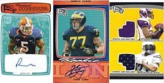
Its that time again, where every single goddamn company needs to release a product SO early that they cant get anything worthwhile into the set except pictures of players in their college jersey. Rookie Progression does this one further - this time putting pictures of players in their college jersey on really fucking disgusting cards. Ugh, I wish the companies would hold their fucking horses and wait for the premiere.
The Good
It will be cheap to pick up a lot of autos of the top guys because this set is crap. If you want a McFadden but don’t want to drop 2 bills, wait 5 months for this to drop under 100. I did find one redeeming factor for this product, the triple autos look presentable. However, if you arent a Beckett Box Breaking douchebag, you wont pull one.
The Bad
Oh, where to start. Besides having more college jersey photos, the layouts of the cards are really weird. Everything just looks like it it doesn’t belong, and I would expect that it doesn’t. The jersey cards are just there to be there, no thought seems to be put into the pairings or anything other than they are all rookies. There's more, but I still have one more category.
The Ugly
This set is one of the ugliest in recent memory. I mean its really that bad of a design. Everything looks retro and it is an EPIC FAIL on that. The cards will drop like a rock and I cant understand why anyone would drop any type of money for this considering its less than 2 months for some real cards.
The worst thing about this product is the name. Whoever came up with this should be fired. Bottom line. Topps DP&P was a good set and needed no revamp. Last year's design was visually appealing and the chrome cards were better than any card in this set. Topps should scrap this faster than a '79 AMC Pacer.
Overall Grade: D
Wednesday, May 21, 2008
Product Review: 2008 Topps Rookie Progression
Labels:
Fugly Cards,
Product Review,
Topps
Subscribe to:
Post Comments (Atom)
.jpg)


I think this is where personal aesthetic appeals will rule the day. I thought last years DP&P was one of the ugliest looking cards.
ReplyDeleteI have to admit, those are pretty damn ugly cards but in my opinion so was last years DP&P.
ReplyDeleteDP&P wasnt the best, but I thought the base design was passable. At least, it was much better than anything from progression.
ReplyDeleteGellman, sorry to post this here, but I couldn't find your email link to add a blog. The Sports Card Info blog has moved:
ReplyDeleteOld blog link:
http://sportscardinfo.blogspot.com/
New blog link:
http://sportscardinfo.wordpress.com/
I'm not the author, but I would appreciate it if you could update your link so others can find it.
Fred Goodwin
San Antonio, TX
Gellman
ReplyDeleteRookie Progression looks like something my 8 yr old nephew created with Legos. I will wait til
Topps gets the new regular football set out and Co-Signers gets around. I have aquestion: Why can't Topps and UD put out nice clean good bang-for-your-buck sets like they used to?