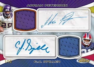
Back in the late 1990s, Topps Finest was just that. However, since the recent switch to the current format, it has been nothing but stale, boring and absolutely ugly. This year's incarnation of the brand seems to be further evidence of this troubling trend for a key product for the company. After seeing the previews for Topps Platinum earlier last month, I think you will understand why I am so underwhelmed by this preview - its basically the same product.
Not only that, but Topps returned to old disgusting habits once again, and the result is less than stellar. First, the main problem with each of these cards is the way they make the sticker the focus of the design. For every product not named Topps Chrome or Bowman Chrome, the designers have this stupid idea that they need to border every sticker so that you have no choice but to look right at it. Rather than hiding the sticker in a design that is built around the player, we instead get a cardboard tetris screen with each element seemingly one long log away from a completed line. The jerseys have borders, the sticker has a border, and meanwhile the player is stuffed away in a corner trapped by the falling blocks. HEY TOPPS - BORDERS DONT WORK ON INDIVIDUAL ELEMENTS PRESENT ON FULL BLEED CARDS. ENOUGH IS ENOUGH!
The worst card in this preview is the Bradford, as it looks almost identical to the ridiculously bad swatch autos out of last year's Bowman Chrome . The swatch covers up so much of the picture that I cant believe someone actually looked at this mock up and thought that it worked. It looks horrid, cluttered, and draws your focus away from a design that really isnt terrible, minus all the other elements that shouldnt be there. Its funny, I actually think that the person who designed this took photoshop and put the swatch window at the EXACT center of the card. I mean, where else could it go right?
On top of all of that crap, Topps is bringing back the Atomic refractor for a sport that has never really been big on gimmicky parallels. Football never had the baseball late 90s, and yet, Topps doesnt seem to get it. The result is a crazy example of when something just doesnt work, and I cant help but feel like they arent trying anymore. Yeah, you would think they would bring the heat with a newly revived license, but they havent shown much from their mid end calendar to this point. I assume once we get the same ole triple threads as before, its only going to get worse.
Most importantly, when you compare this snoozefest to Platinum, the similarities are undeniable, and that should not be happening with so few products on the calendar. The fact that the biggest company in the industry cant design two separate products and get on card autos really makes me question the commitment Topps has to anything other than churning out cookies from their cookie cutter.
When it comes down to it, the golden rule of Topps continues to be a factor with every release. If the product costs more than 100 bucks, stay away. I may have to lower that limit if things continue to head down this path. Wow.
.jpg)


Look at the sell sheet for Platinum. Clausen's name is spelled wrong. Way to go, Topps.
ReplyDelete