Showing posts with label First Look. Show all posts

Monday, June 28, 2010

Is Panini Threads The Start of a Rehash Downfall?

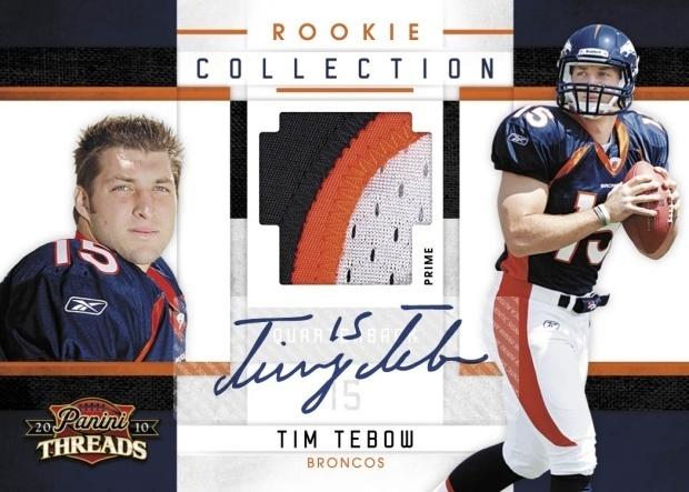
I thought things were a changin', I thought that Panini had finally made a push in the right directions by starting to avoid some of the major design problems that the last 2-3 years of their cards have had. Then I saw the preview for threads yesterday, and all of that promise and hope deflated like the soccer excitement in this country after Saturday.

On top of the fact that these cards look terrible to begin with, they have changed VERY little since 2009's offerings. We still have the same design for the main rookie hits, and most of the subsets are so boring that I had to drink a red bull to stay awake while looking at them. That's not the scary thing though, it gets much, much scarier.

Last year, National Treasures was a 400 dollar box of Threads to begin with, featuring the worst looking product since its inception in 2006. What used to look like aged relic of the past, instead looked like half the shit out of Threads, minus the foilboard. That will not ever fly with me, and if this set is any indication of things to come, we are looking at ANOTHER down year of National Treasures. I was hoping that Panini would learn that you cant just rehash every single part of previous sets and not expect people to notice, but I assume as soon as we get the Absolute Preview, its going to be more of the same ole shit.

This is where the consumers really need to speak up, but with a lack of licensed product from the company known for producing the best looking cards, they may not be able to have that luxury. Then when you consider that so far, Chrome and Flagship are the only products out of Topps' lineup worth being excited for, it may be a full year's worth of boredom on the horizon.

For shame Panini, for shame.


Tuesday, June 22, 2010

Panini Rookies And Stars Shows A Good Direction For Once?

In my opinion, Rookies and Stars was one of the worst looking products of the entire calendar last year. They used weird fonts, splatter paint designs and overall crap concepts to put out a product that a lot of people were very fond of. This year looks a lot better on paper, but I have yet to get truly excited over a Panini design yet this year. Like Elite and Classics, R&S is a million times better than the previous year's offering, meaning that Panini is FINALLY on the road to better design elements in their products. However, I don’t quite think they have truly invested enough time to get to a nice point we can ALL appreciate. I guess we will have to wait for the final product to come out.

One thing I will say is that the signed manupatches are terribly lame and played out, and should be scrapped completely from every product. I get that they are ridiculously cheap to produce and prevent another stickered subset from infesting their overladen products, but they are so goddamn boring now that I cant put it into words.

Here are some pics from Blowout:


Monday, June 14, 2010

One Of My Favorite Days of the Year: Topps Chrome Preview Day!

Saw the Chrome sell sheet on FCB, and I am both ecstatic and kind of sad at the same time. I absolutely love Topps Chrome and I dont think this year will be any different from the looks of things. However, they have added in Bowman Chrome cards and some weird subsets for the second year in a row, and I have a feeling I may get pretty annoyed with this.


First off, the cards look great, as did the base cards from flagship Topps. The autograph cards are still stickers as expected, but they arent done horribly. They still feature borders that call your attention to the fact that stickers are on the cards, but with Topps Chrome, you cant see them any other way. Plus, the boxes cost around 50 bucks a piece, so they get a pass in my book.

Secondly, they are adding in red zone rookie autographs for this product as well, and I am wondering if only part of the checklist will be in base Topps and others will be in Chrome. I would expect we will have to wait for Bradford and Tebow to be in chrome, if that were the case. Who knows, maybe its just a value added type of thing. In that case, the more on card sigs, the merrier. I just hope that the red zone cards are numbered similarly to the rookie premiere autos, as it would be terrible and tiring to have to redo the fake auto fiasco all over again.

Also, I really like the Bowman Chrome cards this year, and it sucks that they wont get their own set. I would much rather have Bow Chro than Finest any day of the week. Hell, take Platinum too, I dont care. Low end Topps = win.

On the bad side of things, the dual autos look kind of stupid, and the patch refractor autos /25 are pretty bad for the third year in a row. Did that patch really need a border on it? No, it just covers up more of the player. Plus, who needs the event used stuff in a product like this anyways? Its like 2008 Topps Stadium Club all over again.

I am eager to see the Topps reprint autos that they mention without pictures, because those could be some of the coolest cards ever. When this was done in both baseball and football a few years ago, people went nuts over them, but a lot of it had to do with hard signed signatures. If they arent hard signed, I will probably pass. Who knows, they could be cool.

Im not saying I will buy as much of this stuff as I did last year, but its going to be close. I love the 2010 Topps design and that should transfer into some awesome stuff from the rookies. The final product will be eagerly awaited here on my end.


Tuesday, May 4, 2010

First Look: 2010 Donruss Classics

Ladies and Gents, stop the presses, I have some news you are not going to believe. I actually like the preview from a Panini set. I just saw the preview pics over on Blowout from 2010 Classics, and I have to say that they didn’t fuck it up at all. Last year's Classics was terrible compared to previous years, but this year's looks to be a VAST improvement.

First off, the base cards look really good, and with Classics, that is one of the most important elements because of the way the Rookie Autos are produced. I would buy myself a Toby Gerhart auto from this without a thought, sticker or no sticker. Then, the HOF auto cards also look pretty good, especially when they are using official logos and such. Nice job there.

The one problem I see is that there is a good chance of some major floating swatch syndrome, as Panini always parallels the hell out of each of the subsets. Look at the Vernon Davis card, then take away the auto, and see what you are left with. Same concept with a few of the others from this preview. Panini builds their cards backwards, which is the reason that a lot of their swatch cards look off balanced. Instead of starting with the base and building the swatch and auto jersey cards in that order, they start with the auto jersey and remove things to get to the base card.

However, with the focus being on the base cards, I think this is pretty good looking.


Tuesday, April 6, 2010

First Look: 2010 Upper Deck Football

A distributor just forwarded me the sell sheet for 2010 Upper Deck Football, and I want to go over a few things that I have to say about this particular choice of cards. You may think this design is familiar, and that is because it is the same one from Upper Deck Baseball. The 2010 Upper Deck baseball set was put out before the lawsuit took hold, and that is where the problem lies.


Last year, Upper Deck's design for their flagship set was great. It was sleek, stylish, and simple, thus highlighting the amazing photography that they have become known for. This year for football, they adopted a design that was built around a logo-less team-less set from an unlicensed baseball product, and it looks terrible. Baseball wasnt great because they had a limited structure to work with, but there is no excuse as to why they transferred it over to football. Continuity isnt THAT important.

Now, this isnt the whole set, but it is enough to make me disappointed that they didnt go a different direction. We still havent gotten a look at any of the case hits like the same day sigs, or the possible inclusion of Premier cards like 2009. However, from what I am seeing, it looks uninspired and boring.

Hopefully the rest of the set looks much better than this. Last year's was good enough that I actually considered buying a box, and I NEVER buy low end stuff. This year, I wont be touching it from the looks of things so far.


Friday, January 15, 2010

2009 Exquisite Is Hitting The Net, I Am Both Impressed and Not

Card Informant has a nice little slideshow of the Exquisite Previews, and after going through the pictures, I am both happy and not. I really like the move towards signed swatches, but I cant stand that the booklets are making their way into a product like Exquisite. Triple Threads sucks because of the horrible concepts used in their products, and though these cards look better than that junk, UD is still using the bad ideas. Exquisite was fine without foldouts.


I am still not sold on the Rookie Patches either, as I get a very Las Vegas feel off of them. The borders look weird, and the gold design throws me, but the cards still look good enough that I would chase a few. Not as good as last year, but definitely better than some of the other high end cards this year.

Although the inscriptions are very cool, Im beginning to see a move towards overuse. Instead of getting one subset or two subsets a year, now we are getting three or four per product, and that could get problematic if it continues to spread. Sometimes you just need the old way mixed with new freshness.

Lastly, the biography cards are awful. Just plain awful. Not only are they booklet cards, but they look like the horrid ones I covered back in the worst of the worst from Chirography. They look boring, they have no originality, and are booklets for the sake of booklets. Bad news.


Tuesday, November 10, 2009

First Look: 2009 Topps Platinum Football

First we had Chrome, then Sterling, now Platinum. I know, lame as hell, right? Well, as a final hurrah, Topps announced via Twitter that they are putting out this set to close out their license with the NFL. I had heard from a few people that Topps was creating a product to directly compete with the perennial awesomosity of SPA, but this is too little too late.


Basically the product is going to be set up exactly like SPA, 24 packs with one rookie patch auto per box and lots of base. Unlike SPA, however, the product is all stickers (as usual for Topps), and the cards look like bastard children of Bowman Sterling and Topps Chrome.

After seeing this, maybe its a good thing after all that Topps is leaving.


Friday, October 2, 2009

First Look: 2009 Topps Unique Football


(CLICK TO ENLARGE)

When this stuff was first put out for baseball, I was definitely turned off by the horrible concept. Now that they have brought it to football with a few tweaks, its not as bad. The Brady card looks much better than its baseball counterpart, and the Namath doesnt look as awful as the tag card that was previewed a while ago on Wax Heaven. Im guessing its because the backgrounds look more finished, and the idea of what is trying to be presented looks more flushed out. However, the Mannings dual is typical Topps, and the Peterson and Roethlisberger look awful.


My thoughts are still that the namesake of this product doesnt really apply to the content, and that is going to be the problem. Its not really any different than what we get out of a lot of other products, so to call it "Unique" is a gross misnomer.

As long as it stays as a mid end set and doesnt stretch cost past the 100 dollar mark, it could be successful, mainly depending on whether or not the other cards are as boring as the baseball ones. With Topps, nothing is set until the product hits shelves.

EDIT: Just got word this product is going to run 140-180 a box. Holy fuck. Yeah, im out.

Monday, August 31, 2009

First Look: 2009 Ultimate Collection Football

I cant believe its this time of year already, but we are getting Ultimate previews, and I love it. The cards have their ups and downs, but there are a few that look VERY cool. Still no word on what the rookie signatures are going to look like, but these mock ups will have to tide us over.


This card is not one of my favorites. Its busy, its weirdly lined, and the design just doesnt look very good. Im pretty disappointed if this is what the base is going to look like, but base is not the focus of this product.


Here is another card that features weird lines, but the team color aspect is pretty cool. Im not really feeling the Louis Vuitton type pattern background, something that I see from upcoming sets is going to be pretty standard. This should look better for other players with better colors.

I love this card. It looks awesome. Last year's ultimate patches were some of my favorite cards, and this year looks like they are going to be as good. Again, it has that pattern, but im glad it isnt too prominent here. This card would have looked that much better without it.


This card looks pretty sweet as well. The odd lines actually look very cool, and the player setup works very well. These will all be on card, and you can imagine how cool some of these will be. I heard there are all the way up to 8, so those could be some of the most valuable ones of the year.


As good as the rookie one looks, is as bad as this one does. It looks like the Romo was pasted onto the bottom of this card, and it may have been salvaged if there was no line below Big Ben. It just looks odd, but does look like a pretty awesome dual if they had chopped off the Romo sig box.

We also saw that there would be more 1997 Legends sigs, which will be great as they were last year, but you already know what those look like. Darrell Green was the player, and im sure that the 2009 HOF class will be added along with him.

Overall, I would still say Im pretty excited for Ultimate, even though last year's looked like it was a lot better. Too bad they couldnt have gone with a preview of the RC autos as well, as those are the focus of the set. Ill reserve judgement until I see them. Lastly, it looks like the inscription cards will be back as well, and deservedly so, as last year they were some of the cooler pieces to obtain. Ive taken a few shots at the 2008 Peterson, but have never been successful. After seeing some of the stuff they put into Philadelphia in terms of inscriptions, I would expect them to be pretty nuts for Ultimate as well.

Comes out in december with the same configuration as 2008.

Tuesday, July 28, 2009

First Look: 2009 SP Signature Edition Football


This set was definitely a surprise edition to the calendar, and I think that I am going to like this product based on the few previews that UD posted on facebook. However, after considering things, I cant help but draw parallels to the awful 2007 Chirography attempt at a product like this. Chirography was such a bomb that any correllation makes me very, VERY weary.

These cards do look very good however, and SP Signature has been a success in the past, but I get a strange tingle up the back of my neck that tells me to be very cautious about latching on to a product like this. First, I know the MSRP wont be ridiculous like it was for Chirography, Im guessing around 80 bucks, and the cards wont be completely cookie cutter either. Factor in that the autos look on card, and I could be pleasantly surprised.

I will say this, to see a great product like Premier get the axe instead of a price and content cut, only to be replaced by another SP set, makes me angry. Maybe things will work out though.